Cosimo Lorenzo Pancini, Art Director, Type Designer and IED Lecturer, talks about the evolution of design and the importance of “design positive”. In the Typography and Calligraphy course at IED, Pancini shares his creative ideas.

Editorial
“Design positive”: from art direction to type design
Date
08 March 2019
Visual Artist, Art Director and Type Designer, Cosimo Lorenzo Pancini has been a lecturer at IED since 2010, coordinator of the Typography and Calligraphy course and founding partner (together with Francesco Canovaro and Debora Manetti), of the intermediary agency Kmzero studio that has created image projects for clients such as Sky, Vogue, Wired, la Repubblica. In this interview, he talks about the evolution of design and its importance in his daily life.
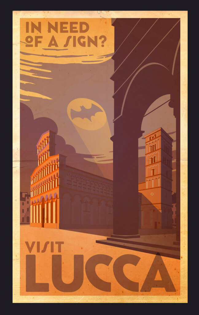
He is the author, with his digital foundry Zetafonts, of typefaces that have spread worldwide, downloaded by over 15 million users and used by clients such as Google, Coca Cola Company, AT&T USA, Target Australia. He was one of the Lucca Comics & Games, creators, for which he has been Image Art Director since 2005.
“Dealing with design is the best way to combine my artistic skills and my natural curiosity with the possibility of doing something useful for others. Sometimes - as in the case of type design - it becomes an obsession, but at the same time, it can be amusing if you can share your passions with the right people. In short, design, like any artistic activity, is intolerant of being considered just a job; it often turns out to be a way of communicating and giving meaning to ordinary living”.
- How do you describe and define your work?
Giving yourself a definition is one of the most difficult things. I usually call myself an Art Director and Type Designer, but that hasn’t stopped me from creating animated shorts, interactive installations, theatre sets, comics and illustrations. I think I am lucky: what I do entertains me and makes me a living. As James Victore says: “Your work is a gift”, and for me, that is true.
- When did you realise you were going to be a designer?
In his book How to, Michael Bierut describes when, as a young boy, his father showed him the logo of a company that manufactured lifts, making him realise how the L of the word “lift” was used to raise the I, creating a visual metaphor. I think the story of a small enlightenment on the road to Damascus has happened to everyone: the discovery of the potential of writing that becomes drawing.
My first contact with type design came when, at age 10, I bought a catalogue of Letraset transfers, which I used for the titles of my comics. Pages and pages of different ways of drawing letters, among which I was lost in amazement.
Like many designers, however, the path that led me to design was not linear but tortuous and full of doubts. Above all, I am self-taught: I have learnt everything I know about my profession by working and reading countless books. Now that I find myself teaching, I am often very envious of my students because I see that they have the possibility and the tools at their disposal to learn in a short time things that cost me a lot of effort and mistakes in the field.
- How was Kmzero born?
The studio was born from the meeting of five people working at the Lcd agency in Florence in 2000. It was a pioneering period for digital creativity, an extraordinary mix of experimentation, hopes for the future and Y2K anxieties. Lcd was my first encounter with an actual contemporary graphic design studio, which, while working for the Florentine reality, kept great attention to the international scene and to the inspirations of avant-garde design, which at the time was the Californian matrix, in the David Carson way.
At Lcd, I met other people who shared my ideas on graphic design as a transmedia and multidisciplinary activity, and working together, we realised we wanted to set up our studio. We rented a flat in the centre of Florence and started the Kmzero adventure. The Zetafonts experience was born shortly after a year of very remunerative but not very satisfying work. We decided to invest part of the earnings in a publication, a book/magazine that we entitled Ego[n]. Among the many goals we had set ourselves was to create a particular typeface for each of the magazine’s twelve albums: a very ambitious idea that allowed us to make an initial small collection of typefaces. Then we started to get into the habit of creating a new typeface for each branding job, and seeing the success of downloads on platforms such as Dafont, Francesco proposed opening our digital foundry to try to market them. Thus, Zetafonts was born, which now has over a thousand fonts published in a hundred families, used by millions of people around the world.
- How do you see and experience the profession of a designer today? How much has it changed over the years?
The digital revolution at the end of the last millennium triggered a process of change and evolution in our profession, the end of which we still cannot see. I have been lucky enough to experience all the innovations and have been the last to use all the traditional technologies. This has equipped me with the skills to embrace new technologies while maintaining a healthy scepticism. I still use paper for sketching projects, and I try not to be too dependent on the latest software. It is important to remember that being a graphic designer and knowing how to use the Creative Suite is different.
- Do you have a design method, or do you change depending on the job and the client?
I was a tireless improviser for years, but lately, I favour the research phase. Above all, I realised that the most critical design solutions are not found alone in the studio but with the client, discussing constructively. That’s why we have been giving a lot of importance to our presentations lately, intended to be a tool for collective brainstorming with the client. When a relatively precise image of the project has been formed in my head, it is time to switch on the computer and finalise everything.
For many years, we were obsessed with the logic of “making lots of proposals”, which forced us to move all over the place and present ideas that often didn’t convince us all that much, and which, in the end, were regularly chosen by clients. To avoid this frustration, in the first phase, we always try to work abstractly on ideas and style, defining the mood and reasons for a project before proceeding with the aesthetic choices. If you do your essential evaluations abstractly, it will only be a question of deciding the most pleasing form, but you will not risk following wrong design ideas.
- How do you keep up to date?
On the Internet, of course, with showcase sites like Behance or Pinterest, coolhunting blogs such as It’s Nice That! or Fast Company… but primarily through books and magazines. The library in the studio has about a thousand volumes, and it keeps growing. In addition, if possible, I also try to attend conferences, visit exhibitions, and expand the range of my knowledge as much as possible.
- What is fundamental for a designer?
I will answer by quoting one of my favourite designers, Jonathan Barnbrook, whose speech to the graduating students of the class of 2015 at Central Saint Martins University ends with a seemingly incongruous piece of advice: “Be kind”. Now, this is a very nice and simple thing. Still, it is essential because the work of a designer or any other commercial artist involves relating to others. Therefore, how you relate to others and your characteristics become critical components to working well. And for us, this is extremely important. If you are a creator, you will spend a lot of time in your workplace, and the difference in your attitude makes it a studio or a mere office. At Kmzero and Zetafonts, we generally don’t believe in an aggressive attitude in business and relationships. We always try to put ideas and dialogue at the centre. This is what we call “design positive”, and it stems from the idea that the work of the graphic designer is never - as is sometimes believed when we are young - “against” the client, but always together with them. And although friends rarely make good clients, the best clients are those with whom you have the friendliest relationship.
- Today you coordinate the Typography and Calligraphy ‒ The Font Design course. How did this idea come about?
The teaching experience has always been part of my life: I have taught comics for almost 20 years and graphics for over 10. When I started getting significantly involved in type design, I thought I would like to meet other people with this passion. Often, teaching is also a way of learning: you say something, better understand your motivations and methods and meet passionate people who give something back. The Typography and Calligraphy course came about with great interest in calligraphy and typography, as you can tell from the countless books or Instagram profiles. We are at the beginning, but the project deserves to grow because it already creates a small community interested in type design culture.
Author: Dominique Barbieri